Redesigning Iconography for NASA Playbook
Designing icons that helped users recognize actions faster in a dense expert interface.

Overview
Role: Product Design Intern
Team: NASA Ames Research Center, Scheduling and Planning System for Exploration (SPIFe)
Timeline: Jan – Mar 2022 (3 months)
Challenge: Playbook’s interface relied on many small icons inside dense timeline views and control panels. The legacy icon set was inconsistent in style, visual weight, and metaphor, which made the interface harder to scan and weakened recognition at small sizes.
Focus: Visual systems, iconography, perceptual legibility, interface clarity, design documentation
Outcome: Rebuilt Playbook’s icon language across two layers:
Icon library: Redesigned the icon set with a stricter geometric framework optimized for small-scale legibility.
Design system: Codified visual rules and handoff guidelines so future icons could remain consistent with the product.
Context
In dense expert tools, small icons carry a surprising amount of responsibility
This project was completed alongside my redesign of Playbook’s constraint experience. While the constraints project focused on making scheduling rules understandable, this project focused on the visual language users relied on to move through the product.
Playbook’s icons aren’t decorative. They’re dense, functional cues that help operators scan timelines, understand activity types, and make rapid decisions. In a system this information‑heavy, unclear or inconsistent icons slow recognition, increase cognitive load, and interrupt expert workflows.
Why this matters
In a dense planning interface, icons act as recognition shortcuts. When they are clear, users can scan and act faster. When they are inconsistent or ambiguous, users have to pause, interpret, and verify what each control means.
What made this hard
Icons had to remain readable at very small sizes, avoid metaphor collisions, and fit into an already dense UI without adding noise. They also needed to scale across dozens of activity types while maintaining a cohesive visual language.

Playbook UI
Original icon library
Problem
The icons looked inconsistent, lost clarity at small sizes, and sometimes slowed recognition
The original icon set created friction in four ways:
Icons varied in style and visual weight.
Some lost clarity at small sizes.
Similar actions could be mistaken for one another.
Some metaphors required too much interpretation.
In a consumer product, that might look like visual inconsistency. In an expert scheduling tool, it affects speed, confidence, and learnability. Every unclear icon asks the user to pause and decode the interface.
Before
The icon set varied in visual weight, geometry, and metaphor. Some icons collapsed at small sizes, while others looked too similar to nearby actions.
After
The redesigned system used stronger geometry, simplified forms, more consistent stroke weight, and clearer differentiation between similar actions.
The goal was to make icons behave less like small illustrations and more like reliable interface controls.
Design principles
Evaluating icons
I defined four principles to assess the icon system not by how polished it looked in isolation, but by how well it performed inside the actual interface.
▣ Legibility
Could the icon hold up at small sizes in a dense UI?
▣ Understandability
Could users infer the intended action or concept without unnecessary interpretation?
▣ Distinguishability
Could similar actions remain visually separate from one another?
▣ Approachability
Could the system feel modern and clear without becoming too playful for a mission planning tool?
From principles to visual rules
The system needed shared structure, not just cleaner individual drawings
To make the system scalable, I translated the principles into reusable visual rules. The goal was not to make every icon identical; it was to create enough shared structure that existing and future icons would feel like they belonged to the same product.
Key directions included:
Filled shapes and bold strokes for stronger visibility
Simplified forms to reduce visual clutter
Consistent geometry to make the library feel unified
Ample internal whitespace so small icon elements remained readable
Rounded corners to create a clearer, more approachable tone
The goal was not to make every icon look identical. The goal was to give the system enough consistency that new icons could be designed without feeling detached from the rest of the product.
Design variations for “book” icon
Exploring visual weight, shape language, and readability.

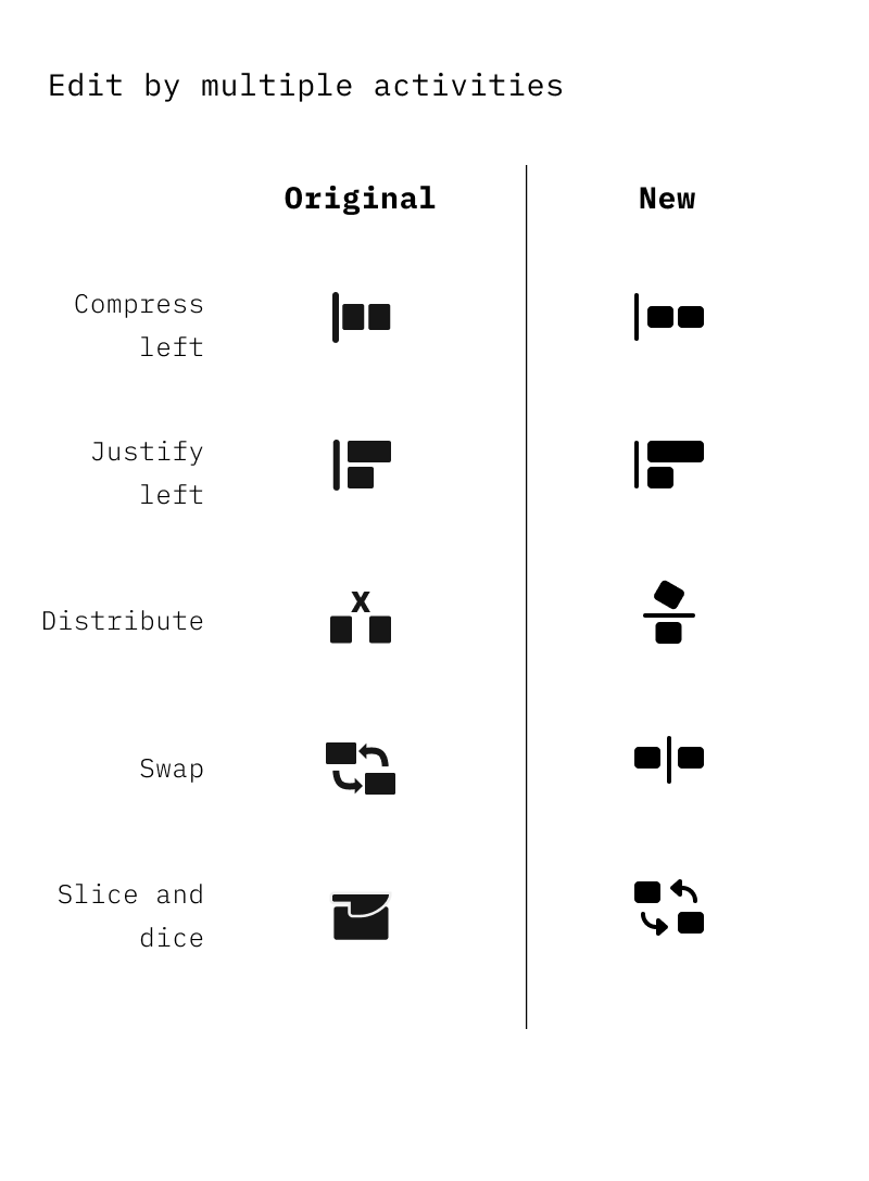
Design variations for “compress left” icon
Testing how action-based icons could stay clear at small sizes.

Redesigning ambiguous icons
Many Playbook icons represented abstract scheduling operations rather than familiar consumer actions, so the redesign had to preserve expert meaning while improving quick recognition.
In an expert tool, ambiguous icons are costly because users build speed through repeated recognition. If two icons look too similar, or if a metaphor is unclear, the user has to slow down and interpret the interface instead of acting.
For each ambiguous icon, I evaluated the action behind the symbol, the clarity of the metaphor, its similarity to nearby icons, and its readability at actual UI size.
The redesign process involved asking:
What does this icon need to communicate?
Is the metaphor recognizable?
Could it be mistaken for another icon?
Does it remain readable at actual UI size?
Does it fit the broader icon system?
Differentiating “copy” vs “clone”

Differentiating “slice and dice” vs “cut”

Differentiating “zoom” vs “search”

Differentiating “distribute” vs “switch”

Final library and design language
The final deliverable was both an icon library and a set of rules for extending it
The redesigned icons used stronger shapes, clearer geometry, and more consistent visual weight while preserving the precision required for a dense scheduling interface.
The redesign was also a scalable visual system, not just a one-off icon refresh. Shared geometry, stroke rules, spacing, and metaphor guidelines made it easier for future icons to feel native to Playbook without redrawing the entire library.
Sample of redesigned icons


Final icon library
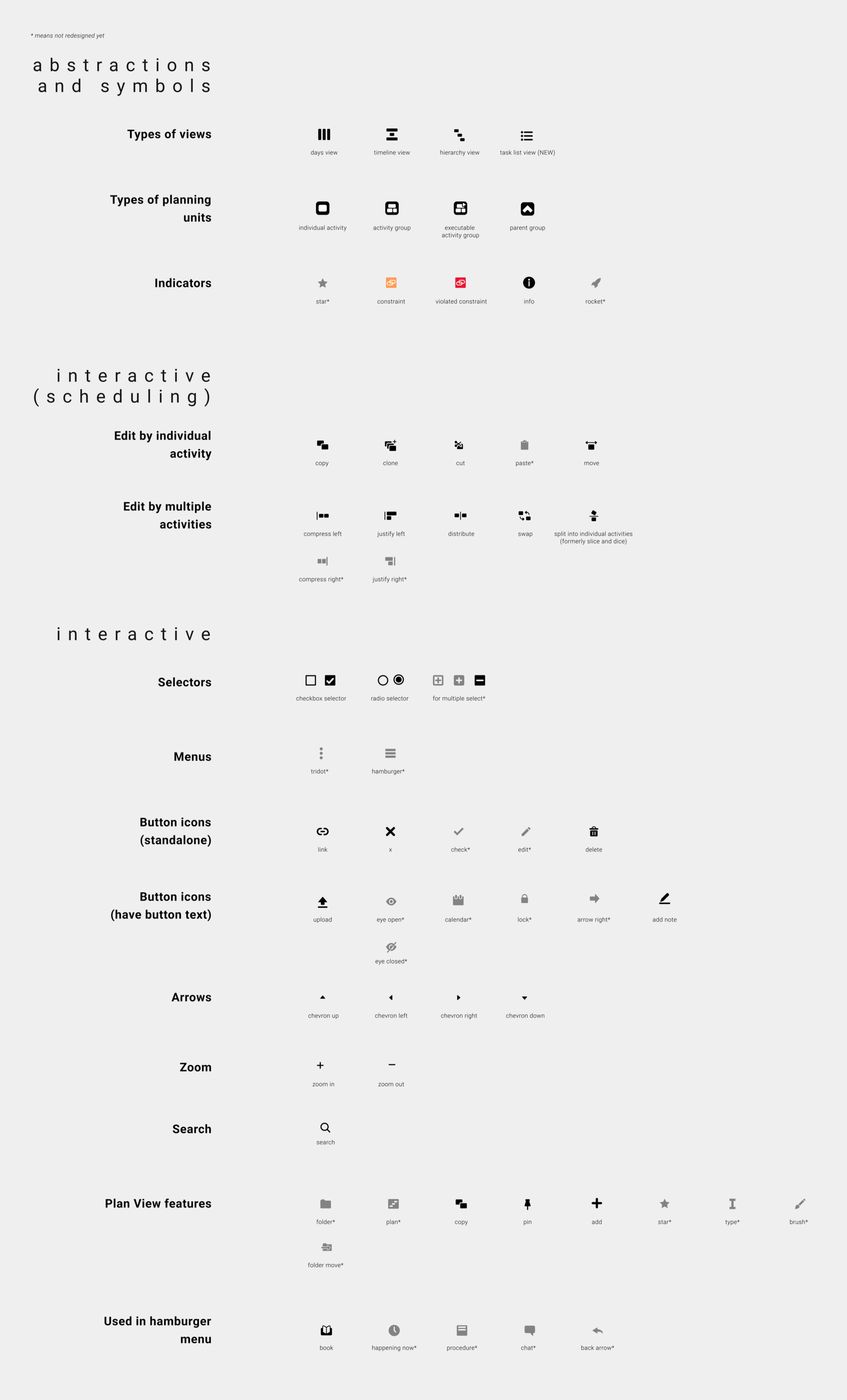
Final library and design language
The redesigned icons used stronger shapes, clearer geometry, and more consistent visual weight while preserving the precision required for a dense scheduling interface.
The redesign was also a scalable visual system, not just a one-off icon refresh. Shared geometry, stroke rules, spacing, and metaphor guidelines made it easier for future icons to feel native to Playbook without redrawing the entire library.

Outcome
The work helped shape Playbook’s longer-term design system
After my internship, I learned from my former manager that some of my redesigned icons remained in Playbook, and the icon rules I contributed became part of the team’s design system.
That mattered because the project was not just a temporary visual refresh. It gave the product a more durable visual language. The system now supports future icons more consistently, reduces ambiguity, and helps users move through the interface with less hesitation.
Reflection
Iconography is usability at the smallest scale
In Playbook, a successful icon needed to be legible, semantically accurate, visually distinct, and consistent with the surrounding system. Style mattered, but only because it supported recognition.
If I continued this work today, I would validate the system through recognition testing at real UI sizes, especially for abstract scheduling concepts that can’t rely on familiar physical metaphors. The goal would remain the same: clarity that scales.